I’m a relatively new hockey fan. And I love data. Come join me on a series of posts as I see explore where a combination of these two interests leads.
Even if you’re not a hockey fan, along this journey I’ll introduce technologies, concepts, and techniques for data analytics that you can apply to the types of data that are more applicable to you.
In this post, I’ll use Power BI to start getting familiar with available data and answer a simple question. You can download a copy of the Power BI file that I created to see for yourself how I put together the data and the report.
Why Hockey?
My husband Dean is originally from Detroit and has long loved the Detroit Red Wings. When we started dating, he would encourage me to sit and watch games on TV which seemed almost constant because hockey has an incredibly long season compared to other sports. I watched, but I have to confess I didn’t have a lot of interest at the time. (Sshhh, don’t tell him I said that!)
One of the ways that I’m inclined to interpret the world is through data. And sports is rife with data! Ever hear of Moneyball? These days it’s common practice for a sports team to have an analytics team. I’ve not worked on a project with any of these teams (yet), although I did have a data analyst from the NFL in one of my classes years ago.
A Hockey Fan is Born
Fast forward a few years and I am a convert! My home town of Las Vegas got its first professional sports team and amazingly the first sport is hockey! Yes, hockey in the desert, go figure… The 2017-2018 season is the inaugural year for the Vegas Golden Knights, and oh what a year it has been! Far better and far more exciting than most people here ever imagined.
Dean and I bought season tickets hoping to enjoy a few good games (and see Dean’s beloved Red Wings whenever they come to town), but I must say most games have been more than good. And live NHL hockey is much more exciting in person than it is on TV. Now that I’m more familiar with the sport, I concede that watching on TV is now more appealing to me as well. My new goal (cough) is one day to meet not only the players, but also the analysts for the Vegas Golden Knights!
Where’s the Hockey Data?
During the games, I often think up questions that could be answered if only I had the data. So I went on a mission to find it and perform my own analyses. I’ve stumbled on a few databases that I need to find time to explore, but these database limit me to looking up information whereas I want to explore the raw data. The best way I have found so far is to use the free NHL statistics API: https://statsapi.web.nhl.com/api/v1. It’s undocumented, but I did find a YouTube video that provides an overview. Thanks to Kevin Sidwar (b|t), who produced that video, I now know that I can use access data by using the following API endpoints:
- All teams: https://statsapi.web.nhl.com/api/v1/teams
- A specific team (Vegas Golden Knights, in this case): https://statsapi.web.nhl.com/api/v1/teams/54
- A team’s current roster: https://statsapi.web.nhl.com/api/v1/teams/54/roster
- A player, such as our famous goalie, Marc Andre Fleury (getting the link from the roster): https://statsapi.web.nhl.com/api/v1/people/8470594
- A specific game (our February 21 game against the Calgary Flames): https://statsapi.web.nhl.com/api/v1/game/2017020929/feed/live
- A team’s current statistics: https://statsapi.web.nhl.com/api/v1/teams/54?hydrate=stats(splits=statsSingleSeason)
- Statistics for each player of a team: http://statsapi.web.nhl.com/api/v1/teams/54?hydrate=roster(person(stats(splits=statsSingleSeason)))
And that’s not all I can do… but it’s more than enough for today! I just have a simple question to answer, but at least I know I have a rich treasure trove to explore in future posts!
Gathering the Team Data
My first step is to use a Web data source using the URL https://statsapi.web.nhl.com/api/v1/teams to see what I have to work with. Then I’ll go through the following steps which I only highlight here (but I’ve included a video below each section if you’re new to Power BI):
- Because the result is JSON, the query returns a list that I can then use the Convert Into Table transformation that appears on the ribbon.
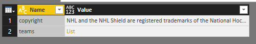
- And I need to remove the copyright from the query (but I copy and save it somewhere because I want to give attribution later in my report). I use the Remove Top Rows transform with a value of 1 to get rid of it.
- My JSON values are still a list in my query results, so I expand the list and then expand the records.
In Power BI, a list is a structure that has a single column and multiple rows. If I were to create a list manually, it would look like this: {“item 1”, “item 2”, “item3”, 4}. Looks like an array to me. The elements in the list do not need to have the same data type, by the way. I’ll use lists in future posts to build out query parameters for dynamic reporting.
A record is a structure that has a single row and multiple columns. Just like a row in a relational table. When I click on a record in one of the rows, the user interface shows me the columns as rows below the table like this:
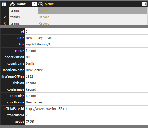
- When I expand the records in the query (by clicking the Expand button to the right of the column name), I get columns in the table like this:
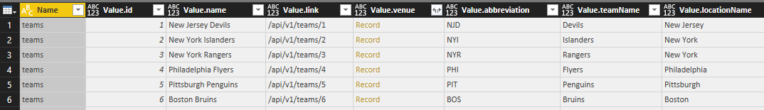
- I still have some more expansions to do to get data for each team’s venue, division, conference, and franchise details. Part of me wants to normalize this data a bit and break these out into separate tables. For now, I’ll leave the data as is, other than renaming the columns for clarity.
In a few clicks, I was able to get all of this information into a single table. Nothing statistical here to analyze yet, but definitely the base information for each team that I can use to slice and dice later.
Gathering Game Scores and Team Records
 One of my feelings at the game I attended this past week between the Knights and the Calgary Flames (on February 21, 2018) was that it was a pretty high scoring game as hockey goes. But I’m a newbie, so what do I know? I want to find the data to support (or refute) this hypothesis.
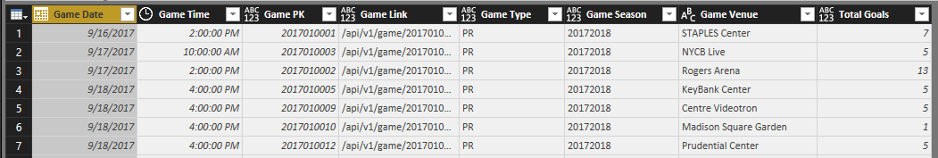
To keep things simple for now, I’m just going to analyze the scores for the current season and tackle other seasons later. The URL I need is https://statsapi.web.nhl.com/api/v1/schedule?season=20172018 which I use to create another query in Power BI.
Ooh, there’s so many things in here I want to explore, but I’ll save that for another day. I can always modify my query later. For now, I’m going to focus only on scores for the home and away teams for each game of the season.
Cleansing and Transforming the Data
Right now, the data is not ideal for analysis. Keeping in mind how I want to use the data, I need to perform some cleansing and transformation tasks. Any time I work with a new data source, I look to see if I need to do any of the following:
- Remove unneeded rows or columns. Power BI stores all my data in memory when I have the PBIX file open. For optimal performance when it comes time to calculate something in a report and to minimize the overhead required for my reports, I need to get rid of anything I don’t need.
- Expand lists or records. Whether I need to perform this step depends on my data source. I’ve noticed it more commonly in JSON data sources whenever there are multiple levels of nesting.
- Rename columns. I prefer column names to be as short, sweet, and user friendly as possible. Short and sweet because the length of the name affects the width of the column in a report, and it drives me crazy when the name is ten miles long, but the value is an inch long—relatively speaking. User friendly is important because a report is pretty much useless if no one understands what a column value represents without consulting a data dictionary.
- Rearrange columns. This step is mostly for me to look at things logically in the query editor. When the model is built, the fields in the model are listed alphabetically.
- Set data types. The model uses data types to determine how to display data or how to use the data in calculations. Therefore, it’s important to get the data types set correctly in the Query Editor.
- Add custom columns. This step is optional and depends on whether I want to create a new column in the query itself or in my model only. Given a choice, I lean towards building the custom column in the query. That way, if I need to use the information in multiple ways later, I have the logic defined once.
In this case, I’m adding two new columns:
Game Name, to concatenate the away team and home team names in addition to the date so that I have a user-friendly unique identifier for each game to use in my reports.
Total Goals, to calculate the sum of the away team score and the home team score. This is the key to answering my first question, what constitutes a high-scoring game?
- Apply filters. This step is similar to the first one in which I remove the unneeded rows or columns. However, in that first case, I was identifying specific rows (as in the top n) or columns (by name). Now I need to consider conditions that determine whether to keep a row.
In my current data set, I can see that I have games included that haven’t happened yet. For my current purposes, I want to exclude those rows that have a date earlier than today, which of course is a moving target each day that I open the report. Power BI doesn’t allow me to set a filter based on today using the filter interface. Instead, I set the filter using an arbitrary date, and then open the Advanced Editor for the query and change the filter that uses a hard-coded date to a formula like this:
#”Filtered Rows” = Table.SelectRows(#”Changed Type2″, each [Game Date] < Date.From(DateTime.LocalNow()))
Restructuring the Data
I’ve spent twenty years building dimensional models, so that’s the way I tend to think about structuring data. I won’t spend time in this post explaining that approach. Just trust me on this one for now. Developing a data model depends on your end goal, and I’ll spend some time in one or more future posts on this topic.
Right now in my current query, I have away and home team data in separate columns which means I can’t easily build a report to see all scores – whether home or away – for a single team. I’d really rather have each row in my games table represent a single team. But I also don’t want to have rows that duplicate data for a single game. Gah!
To solve this problem, I’m going to duplicate the games query and then make adjustments to one version so that it contains only game data. The second version will contain the team data.
For the games query, I remove the columns that relate to teams, records, and scores (although I’ll keep the Total Goals column because that’s game-level detail, not team-level detail). Now I have this result:
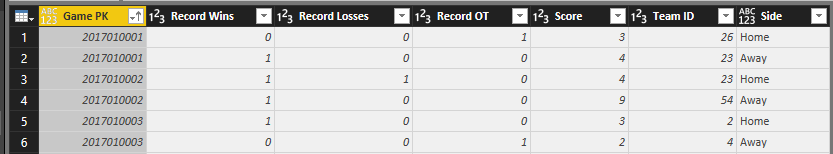
And for the scores query – I remove the game-related columns, except for the Game PK column which I can use to tie to the two queries together later in a relationship.
But first, I’m going to take another step to duplicate the scores query – because what I really want to have is a single column each for teams, wins, losses, score, etc. I filter one version of the scores query to keep only the away team data and the other version to keep only the home team data. And I add a custom column to each query to designate it as home or away, and then combine the two queries to make a single final query that is really the one I’m going to relate to the game query later.
I clear the Enable Load on the scores away and scores home queries so they don’t get added to my model. I only need them as intermediate steps to build the final scores query.
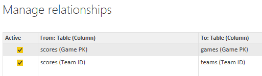
After I click Close & Apply, Power BI automatically detects the relationships:
Answering the High Score Question
Now that my data is structured appropriately for my analysis, I can set up a report to view the data in different ways.
The final result contains the following visualizations:
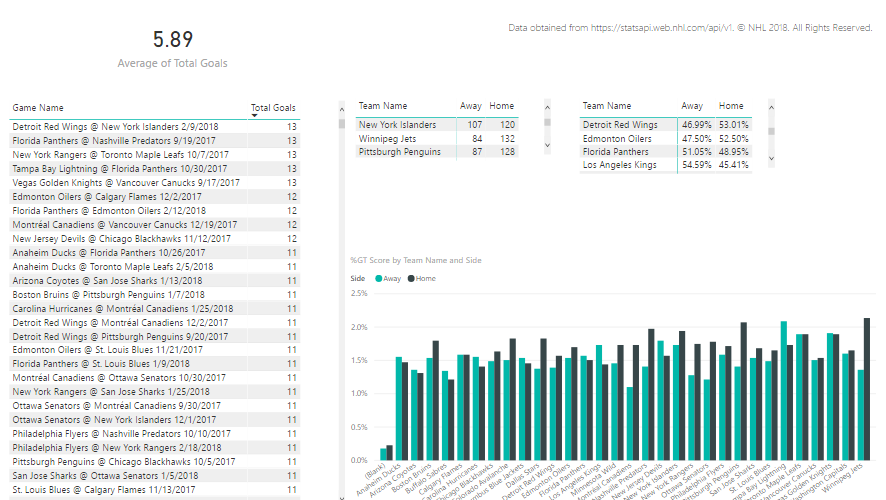
- Average of total goals. I set this up to calculate the average of total goals for all games to use as a baseline against which I can measure whether a game is relatively high-scoring or low-scoring. I also set this up to ignore any cross-filtering that might occur when I click on other visualizations in the report, because I want to see this value calculated for all games across the league for the season.
- Table of games and total goals. Here I have a comprehensive list of games that I have sorted in descending order of total goals. When I click on a specific game in this list, the other visualizations on the page are filtered to show me the details for that game (except for the average of total goals).
- Matrix of teams and scores by side, Away vs. Home. This matrix sums up the goals for each team based on whether the game was an away game or home game. When a game is selected in the first table, this matrix displays each team’s score for the selected game. When all games are listed, this isn’t a particularly interesting table to me, but it made me think about comparing the statistics for the season by side, which led me to create the next table.
- Matrix of teams and score percentages by side, Away vs. Home. This matrix is a copy of the scores matrix, but I changed the values to display as a percentage of row total. I thought it would be interesting to see overall whether a team did better or worse at away versus home games. When a game is selected in the table, the values are 100% so it’s not interesting at that point, but it is interesting when you look at all teams even though I need to scroll through it. I don’t have a lot of space on this page. Yes, I can adjust the page size, but my primary interest at the moment is looking at high-scoring games – this was just an ancillary thought that I might pursue later in a new page of the report.
Thinking out loud—Wouldn’t it be nice to hide or show an entire visualization based on some condition?
- Column chart of teams and scores by side, Away vs. Home. Here I can see how the teams compare. I can write a whole post about this visualization in particular, but not today. Stay tuned. When I select a game, I can see the scores for each time represented visually in conjunction with the matrix above it.
My report provides a lot of information about game and team scores overall. In thinking about the game that sparked my question, which had a total goal of 10, I can see that there have been a LOT of games with higher scoring. On the other hand, I can also see the game was also well above average.
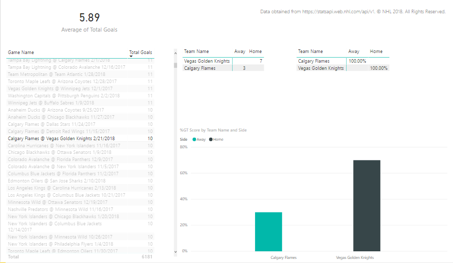
When I select the Flames @ Golden Knights game in the table, I can see the game score by team in the matrix and in the column chart.
Summary
Important takeaways in this post include the use of multiple features in Power BI:
- Using JSON as a data source
- Getting familiar with lists and records
- General steps for cleansing and transforming data in the Query Editor
- Restructuring data with filters, custom columns, and the use of the append query feature
- Excluding intermediate queries from the Power BI model
- Creating visualizations: card, table, matrix, and column chart
- Displaying an average value rather than a sum
- Displaying percentage of row totals
- Cross-filtering
- Adjusting interactions
Whew! That’s a lot! This post covered a lot of ground, and there’s so much more I want to cover! You’ll just have to come back again to see where I go with this.
If you have any questions or suggestions about what you’d like to see in the future, please add a comment below!
Click here to continue to Part 2 of this series.
You can see how I set up the report in the videos below.
19 Comments
[…] Stacia Varga shows off some of Power BI’s filtering and data processing capabilities by lookin…: […]
But the magnetic field occurred earlier in the month; the teamâs data started from February 4.
I don’t understand what you mean by magnetic field. Can you clarify? Which team are you referring to in which the data starts from February 4? I’m happy to look more closely at this, but I need more information. Thanks!
[…] hockey data that I started exploring in Part 1 of this series is just the tip of the iceberg. I have so many questions that standard hockey statistics reporting […]
[…] my excitement about getting the data and a burning question at the time that I acquired it led to my first post in this series. Then I needed to validate that I had put together the data correctly by viewing player statistics […]
[…] can rewind to the beginning of the series by starting here and then following the pointers at the end of each page to the next post in the […]
[…] “see” a project in action. You can rewind to the beginning of the series by starting here and then following the pointers at the end of each page to the next post in the […]
[…] wrangling and some sanity-checking of the data in Parts 1 through 5 of this series (which starts here if you need to figure out what I’m up to and why), I’m ready to start using data […]
Awesome tutorial, Stacia! I’m looking forward to others. I’ve been working with Dimensional models for more than 10 years now. Unfortunately I’ve worked exclusively for small companies as a “one man show”. I’ve not had the technical feedback I would like, though I have many happy users. Philosophically I take exception to your position about model design. I believe all software and software/database solutions model some reality. In my professional life, that reality is a transportation company. In these tutorial that reality is professional hockey games. So when you say, “Developing a data model depends on your end goal …” , I think I disagree. A data model, developed at the correct level of detail (a.k.a., grain) will allow a user to answer ANY end goal question. I see this problem where you had to duplicate the games query in order to answer a different question.
The difference may be I’m confusing what I think of as a data warehouse with using Power BI as a reporting/analysis tool. I’m new to Power BI and have already learned much from this your first tutorial (the first one I’ve watched , anyhow). I’ve built many data warehouse in different technologies. Most recently in SQL server. We are looking at using Power BI as reporting tool AND pushing our users to self-service, creating their own reports and analyses. But I still need to create a Power BI model for them. Never the less, I try to create a “generic’ model for the “class” of questions they are trying to answer.
I’m looking forward to learning more from you.
I see where you are coming from, but I still stand by my claim that a data model depends on your end goal. I’ve been working with dimensional models for 20 years now, and I continue to believe that we build models to answer specific questions. And models tend to require an evolution over time. The more questions we can answer in the first iteration, the better. When we start, we keep in mind the questions “the business” knows it wants to get answers to on a regular basis. And these are generally known. The beauty of the dimensional model is that it supports creating various combinations of answers, especially combinations that might not have been anticipated up front but ultimately prove to be fruitful. However, the universe of possibilities is still finite.
If the business wants to start getting answers to new questions that were not already accounted for in the model, then we have to rework the model, and rework the ETL processes, and those things take time. And this is the criticism with old-school BI – even though it was supposed to empower more self-service, users still wound up waiting for the model to include the structure and data necessary to answer the new questions. So enter the tools such as Power BI to get to that faster answer without the strict modeling and processes. (And enter a whole new can of governance worms… but I digress!)
This is where the “modern” world of BI is making big advances that I find intriguing. And I will get to this discussion in more detail eventually. If we can store the data cheaply and not have to decide how we model it right away, we CAN ask and answer questions that had not been previously anticipated. Sometimes those answers turn out to be worthless – but no harm, no foul. We haven’t invested a ton of money and time in building the model to find out if there’s a good answer or not. We just have to spend on storage, and that’s so much cheaper these days than it was 20 years ago. And when some answers turn out to be incredibly valuable, then the business gets to decide if moving it into a “proper” model and formal processes for repeated analysis is worth the added time and money. So that’s the line I’ve been thinking about lately with regard to models – the kind of questions, random or “standard operating procedure”, we are supporting.
Hopefully that makes some kind of sense! I look forward to hearing more from you and hope not only that I can teach you something along the way, but learn something from you too!
Ok, never mind. I watched the last part again. I see where you are going with all this.
I think you raise some valid points in your original post. And I welcome the opportunity to hash it out to come to a meeting of the minds. Thanks for reading! And thanks for continuing through to the end to see where I was going. 🙂
[…] we’re still at the tip of this iceberg with this ninth post in my series that started with Getting Started with Data Analytics in Power BI. For now, Power BI continues to be my tool of choice, but the preparation I’m currently […]
[…] want to continue exploring visualizations for distributions using the dataset that I introduced in my first post in this series if you need to catch up with what I’m up to here. So far, I’ve used a histogram on a […]
[…] the previous post in this series (which began all the way back in February 2018 with Getting Started with Data Analytics in Power BI, I explained how an important part of descriptive analytics is to evaluate relationships between […]
[…] hockey data to explore the subject of data analytics in Power BI (which began all the way back here), I have been focused on “using” the data, and was generally refreshing data whenever I […]
[…] JSON files into Power BI as I’ve been discussing in a series that started earlier this year here. In my last post, I decided that the refresh queries are getting too slow for my liking and I want […]
[…] As I mentioned in my previous post, I’ve been wrangling at lot of JSON lately. And, in my spare time, I’ve been wrangling a lot of hockey data, launching a series of posts that began here. […]
I’m new to PowerBI and a big hockey fan, I really enjoyed your post.
Question: how would you evolve your model to track which teams are “hot” (win streak of 5+ games), and which teams are “not” (losing streak of 5+ games)?