In the previous post in this series (which began all the way back in February 2018 with Getting Started with Data Analytics in Power BI, I explained how an important part of descriptive analytics is to evaluate relationships between variables and in particular focused on categorical variables.
This time, I will shift over to a study of relationships between numerical variables. A common way to start exploring this type of relationship is to use a scatter plot.
Let’s start with something easy and understandable to analyze. If I put age on the horizontal axis and weight on the vertical axis. It’s a common practice to put an explanatory variable on the horizontal axis and a response variable on the vertical axis. In other words, I’m looking to see how an increase in age (explanation) affects – or not – weight (response) for all the hockey players in the current season, regardless of team.
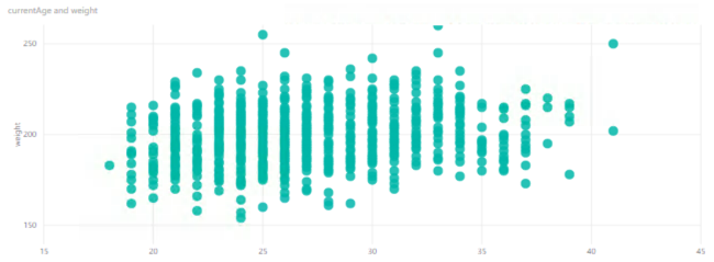
If I put age on the horizontal axis – does this explain weight? Sort of – the combinations of age and weight have some groupings. It almost appears that there is a greater number of younger, heavier players than older, heavier players, but it’s hard to tell here how the age/weight combinations are distributed because I can’t see all the individual points.
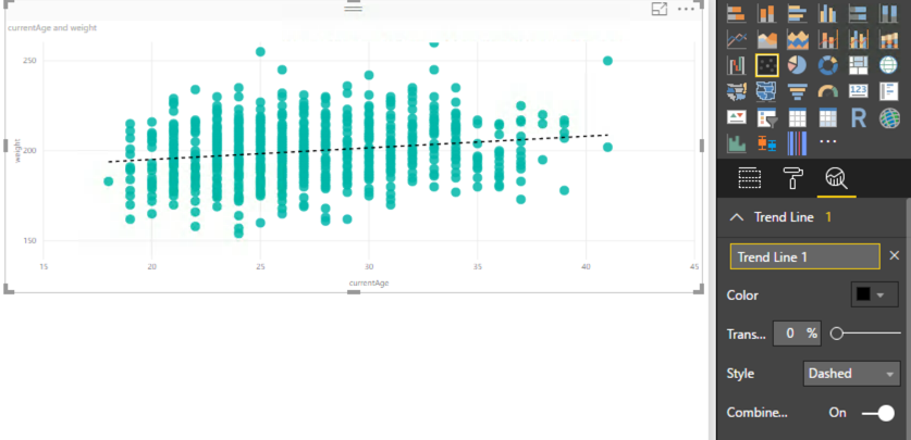
One of the analytical features that Power BI has built-in is the trend line. When I enable that feature (by clicking the magnifying glass icon to the far right below the visualization selectors and clicking Add), I can see that Power BI finds a trend statistically that moves slightly upward and to the right. In other words, as the players are getting older, they are slightly increasing in weight overall.
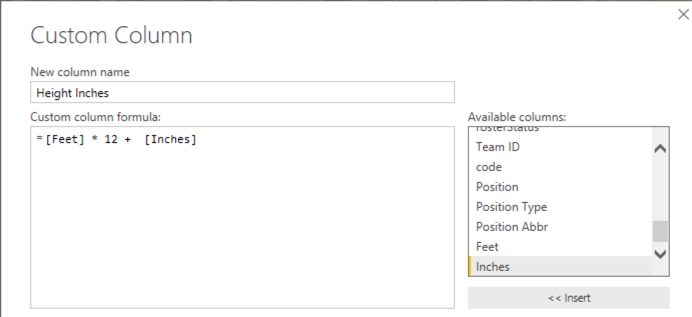
What if I looked used height on the horizontal axis? Now I need to fiddle with the players query a bit. I need numeric, continuous data for each axis in a scatter plot. However, the height is currently in my data as feet and inches, like this: 6’11”. I need all inches (because I’m American and we failed at the transitioning to the metric system in the 70s… I’m sorry), so I’ll edit the query:
- Duplicate the Height column
- Split the result into two columns based on the ‘ symbol
- Replace ” in the second new column with an empty string
- Change the data type on the new column to Whole Number
- Renaming the two columns as Feet and Inches
- Add a column named Height Inches to multiply the value in the Feet column by 12 to which I add the Inches column
Now when I create a scatter plot for height and weight, and add in a trend line, for good measure, I can see a more clear (and understandable) relationship between the two variables. Notice the trend line rises more sharply to the right. As players get taller, they tend to weigh more, too.
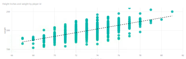
No shocking revelation here, I know. But this is a nice, simple example of a positive correlation between two variables. As height increases, so does weight – in general terms and in this data set.
And this is as good a place as any to insert the caution that correlation does not imply causation. That is, just because a player is taller does not cause the player to weigh more. In this case, the two variables happen to be related, that’s all.
I can easily do some interesting comparisons to add in Team Name as a categorical variable and use colors to differentiate between points by team. The Vegas Golden Knights are 2-2 in Round 2 of the playoffs with the San Jose Sharks, so I’m interested to compare these two in particular right now.
You can play with the data, too, to compare two or more teams by selecting different teams in the slicer on the left, although the colors won’t match teams necessarily – I hard-coded the colors for this report.
You can download the PBIX if you want to take a closer look and/or refresh the data.
In the business world, it’s common to explore relationships between numerical variables. Here are just a few examples:
- Sales dollars versus advertising dollars
- Sales dollars versus weeks since the first of the year (or some relevant time period)
- Income versus count of a defined population (customers, geographic region, etc.)
I see that I don’t have a lot of numerical variables in my hockey data overall, so I’m doubtful that I’ll find anything interesting by creating more scatter plots. For example, if I look at player statistics, I can pretty much guess without looking that a player’s number of goals in a season are going to increase as the number of games he played increases.
I think I’ve exhausted the possibilities with basic data exploration of the data that I have thus far. It’s time to start reviewing standard hockey metrics and enhancing my data model to include them… next week! That way, I’ll have a range of options in my data for exploring more visualizations and features in Power BI.
1 Comment
[…] Stacia Varga continues her exploratory data analysis series using hockey data: […]