I knew I had a lot to say in this series…and we’re still at the tip of this iceberg with this ninth post in my series that started with Getting Started with Data Analytics in Power BI. For now, Power BI continues to be my tool of choice, but the preparation I’m currently undertaking for various analytics projects gives me all sorts of wild ideas to try out with other technology later, so stay tuned.
The latest news related to this series is that my favorite hockey team Vegas Golden Knights swept the Los Angeles Kings in the first round of the 2018 Stanley Cup playoffs and won the first game against the San Jose Sharks in the second round of the playoffs. Sadly, they lost the second game in overtime last night. I’m still on a quest to determine if this overall fantastic performance was predictable, but I’m jumping the gun. I continue to have a lot to learn about the data that I have collected thus far.
In this post, my focus remains on descriptive analytics. In future posts, I’ll discuss predictive and prescriptive analytics. But for now – let’s stick to descriptive… Looking back over the prior posts, I realize that I never provided a definition of descriptive analytics. Shame on me.
In essence, we use descriptive analytics to look at historical data and use it to describe what happened. No forecasting, no what-if scenarios…just the facts, ma’am (or sir).
Descriptive analytics can use basic statistics and visualizations to summarize the data that we have to understand the historical data. In the old-school business intelligence world, we would include the ability to “slice and dice” the data in the domain of descriptive analytics.
What’s the process?
In general terms, the descriptive analytics process contains the following steps:
- Exploring the data to identify numerical and categorical variables
- Calculating simple statistics to get counts for categorical variables and middles/outliers for numerical variables
- Assessing where data is potentially missing and figuring out why
- Cleansing the data where possible
- Reviewing the data distribution as I describe here, here, and even here
- Reviewing relationships between key variables
This last step is the focus of this post. I’m going to continue using hockey data for exploring categorical variables, but the concept easily translates to business concepts.
Categorical variable relationships
A common way to review categorical variable relationships is to create a cross tab, also known as a matrix, to evaluate the counts for each resulting combination.
For example, in my current data set, I can create a matrix to compare the number of players in two teams, say the Knights and the Sharks, by position and by handedness.
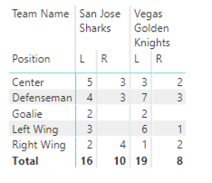
In descriptive analytics, I’m not trying to prove anything by looking at these values. I’m just reporting them. (Although I do find it interesting that there is a preponderance of lefties in these two teams.)
In the business world, I might do something similar by placing product categories on rows and customer geography (country or state) on columns.
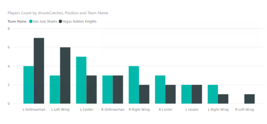
And often it’s helpful to look at this data visually by using a column chart to compare the results. Cognitively speaking, it’s a lot easier to evaluate differences by comparing lengths of columns than to do the mental math of comparing values in a matrix.
The “problem” with pursuing descriptive analytics like this is that I have to try all the possible combinations to determine whether I have found a meaningful relationship or not. That’s when the ability to automate this process to uncover the interesting combinations becomes super important. But that’s a discussion for another day.
Meanwhile, you can explore this particular combination of categorical variables using your favorite teams:
In my next post, I explain how to review relationships between numerical variables.
1 Comment
[…] Stacia Varga shows one way of learning about the relationships between categorical variables in Powe…: […]