Now that I have data both for my goals and for my subsequent goal-related activity as described in my first post in this series, and I have added calculations to quantify my progress as I described in my previous post, I’m ready to start visualizing that progress, which is where Power BI really shines.
For visualizing my goal progress, I want to use visualizations that either show me over time by day whether I’m hitting my target or whether cumulatively I’m above or below my goal for a point in time. In this post, I’m going to use three styles of Power BI visualizations to achieve the “at a glance” assessment of my goal progress that I want: a line and column chart, a KPI, and a clustered column chart.
Line and clustered column chart
While most of my goals are tasks I want to perform x number of times in a week or quarter, my Move goal is daily. For this reason, I want to visualize my daily result to see whether I’m actually hitting my goal on a daily basis.
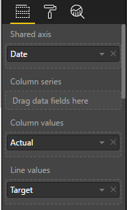
A line and column chart is a good way to see this information. I can have the days display along the horizontal (or x-) axis and use columns to represent the number of calories I expended on that day, as measured by the Actual value in my data model. I can then use a line superimposed on the same chart to represent the target value.
To set up the chart, I perform the following steps:
- Anywhere on the report page in Power BI, I click an empty area just to make sure I don’t have something already selected and then I select the fields that I want to use in my chart: Date (from the Date table), Actual (from the Actual table) and Target (from the Target table).
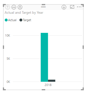
Power BI assumes that I want to compare Actual and Target side by side and creates a clustered column chart.
It also assumes that I want to drill from year to quarter to month to day and sets up a hierarchy for the horizontal axis, which I can see in the visualization pane.
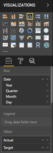
I can click the arrow button in the top left corner of the visualization. This lets me drill down to individual dates, but a faster way to get what I want is to fix the Axis definition in the Visualizations pane, just like I did in my last post– clicking the arrow to the right of Date in the Values well in the Visualizations pane, and then selecting Date.
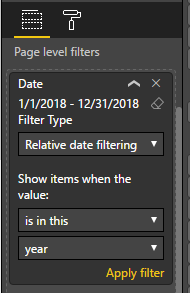
- Now my chart is super messy because it’s showing target values from January 1, 2018 to December 31, 2018. I can place a filter on the page to restrict the dates to a range from January 1, 2018 to today.
Scrolling down the Visualizations pane, I can locate the Page Level Filters section and drag the Date field from the Fields pane into the box labeled Drag Data Fields Here. In the drop down list I’ll switch from Basic Filtering to Relative Date Filtering and then set a range.
Because I’ll be looking at this report throughout the year and don’t want to change this filter all the time, I’ll set the filter to “is in this year”. I need to click Apply Filter for the change to update the chart.
- Next I don’t need to see the target value repeated as a column next to each actual value. Instead, I can use a line to give me a benchmark against which I can compare the actual value. So I’ll select the Line and Clustered Column Chart in the Visualizations pane.
I need to be sure that the chart I’m fixing is already selected (I can tell by the border around it) before I change the visualization type, or else I’ll create a separate new chart. If that happens, I click the ellipsis (…) in the top right corner of the visualization and select Remove to get rid of it.
- My next step is to move the target value from the Column Values well to the Line Values well.
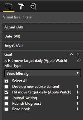
- And then I need to apply a visual level filter because this data is for all my goals, and I only want to display the data for my Move goal. To fix this, I drag the Goal field from the Target table and drop it below Target in the Visual Level Filters section of the Visualization pane. Then I select the goal I want to focus on, Hit move target daily (Apple Watch).
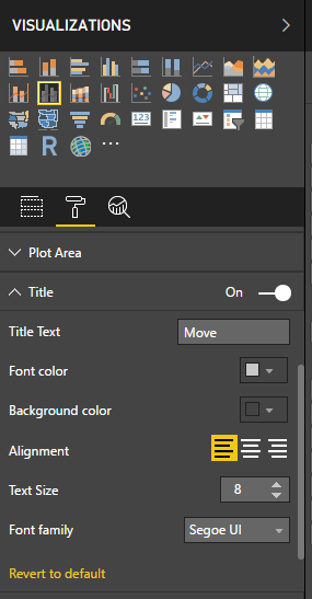
- One last little step to make it clear which goal I’m looking at here. In the Visualization pane, just below the visualizations to select, I can go to the formatting for this visualization by clicking the little Paintroller icon. (I still need to be sure to have my visualization selected.)
When I expand the Title section, I can modify the Title text to Move. I also have the option to get fancy by changing colors, alignment, text size, and font family, but I’m just aiming for simple changes today! There are a lot of other formatting changes that are possible to make here.
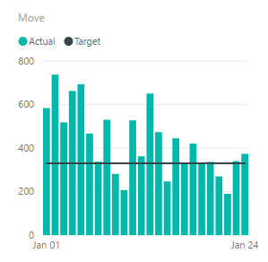
Tada, I can see how I’m doing, and um… apparently, I’ve been trending downward the last couple of weeks as compared to the first week of January, and missed my goal a few times. But at least not MOST of the time. (I’ve been busy recording a new Pluralsight course – that’s my excuse and I’m sticking to it!)
KPI
Another interesting way to look at goal tracking for a goal in which time is an important element, such as my daily Move goal, is to use a KPI visualization.
Just as many businesses use KPIs, which is an abbreviation for key performance indicators, I can use a KPI to see my current metric value, as of the last date for which I have collected data. In Power BI, not only can I see this value, but I can also see how it compares to the target at a glance, through the use of color. Red is bad and green is good, by default, but I can use the formatting options to change this. And I can see how the value trends over time, much like my current line and clustered column chart does.
To create my KPI visualization:
- Click an empty spot in my report to clear any existing selections and then click the KPI visualization in the Visualizations pane.
- I’ll add fields to each well for the KPI. Actual goes into the Indicator well, Cumulative Target goes into the Trend Axis well, and Target goes into the Target Goals well.
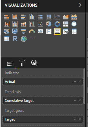
- And to finish off, I’ll change the title on this visualization to Move, just as I did in the previous example.
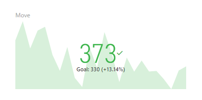
The final visualization shows the Indicator as a color-coded value for the latest date in my source data. Because this value is above my goal, the target value shown in smaller text below the indicator, the indicator value is green. Next to the goal value, I can also see a percentage of how far above my goal the current value is. Yay, me!
In the background, I can see an area chart that plots how my actual value compares to my cumulative target. It looks a lot like the columns in the first chart I created. I don’t see axis labels here because the idea is to show direction and not precision. If the current indicator were below my daily goal, this area chart would display in red.
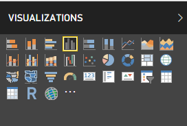
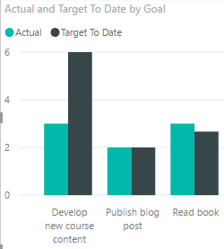
Clustered column chart
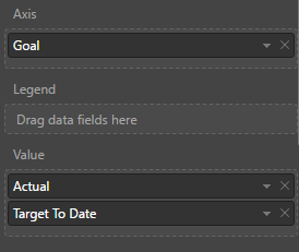
With the exception of journal-writing, the remaining goals are not daily goals, so I only want to see how actual compares to my target to date at this point in time.
A clustered column chart allows me to do this comparison easily:
- I click a new spot in my report and click the Clustered Column chart in the Visualization pane.
- I then add fields to the Value well, Actual and Target To Date, and then drag Goal from the Target table to the Axis well.
- I need to filter goals here because the Move goal is so high relative to the others that I can’t see my progress and I already have two other visualizations dedicated to that goal. When I scroll down to Visual Level Filters, I select the Select All check box and then clear the Hit Move Target Daily (Apple Watch) check box.
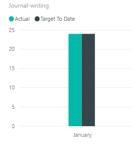
- Journal writing is a daily goal and its cumulative value is high relative to the other goals. I think it would probably look better if I made a separate visualization for it, so I’ll clear its check box also.
With regard to my journal-writing goal, I think monitoring my goal on a monthly basis is satisfactory. Daily doesn’t really help as either I did or didn’t. It’s not like the Move goal which has an Actual value that varies by day. Again, a clustered column chart works here.
- I can short-cut the process by copying my existing clustered column chart and pasting it to another area on the page. I just click the chart to select it, click Copy on the Home tab of the ribbon, click Paste on the ribbon, and drag the new chart to a clear spot on the page.
- Then I can adjust the Visual Level Filter by clicking Select All to clear all the check boxes, and then clicking Journal-writing.
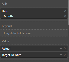
- Now I want to put Date on the Axis. The date hierarchy appears again but I want Month this time so I’ll click the X next to Year, Quarter, and Day, respectively, to leave only Month.
- Next I remove the Goal field from the chart by clicking the x to the right of Goal in the Axis field.
- Last step is to adjust the title in the formatting options.
As more months get added, I’ll be able to see whether I’m keeping up with my journal-writing goal. So far, so good. (Of all the things I do in a day, that’s probably the easiest!)
With these four visualizations, I have a good perspective of my progress on each goal. I can rearrange the visualizations and resize them on the page to suit my taste, and then all I have to do from now on is keep my data up-to-date in Excel, and then open Power BI Desktop and click Refresh.
I’m doing ok on most of my goals, except for new course content. That course isn’t due until April, so I’ve got some time to make up for it, but I don’t want to lag too far behind my target. Next week I’ll start catching up!
On the other hand, I’m slightly ahead on reading. I’ve been finding pockets of time waiting on something (or someone), and I can use that time effectively by popping into my Kindle app and reading until my wait is over. Unfortunately, content creation is not as compatible with these random pockets of time.
Hopefully, you’ve learned something about Power BI by following along with me on this journey and are inspired to go crush your own goals, business or personal, this year!
1 Comment
[…] Stacia Varga methods of visualizing progress toward a goal using Power BI: […]