It’s that time of year when (almost) everyone around you is talking about New Year’s Resolutions, goal-setting, vision boards, new beginnings, bucket lists… well, you get the idea. Any time of year is a good time to reflect on where you want to go and how you want to get there, but goal-setting at the start of a new year has been a tradition for centuries.
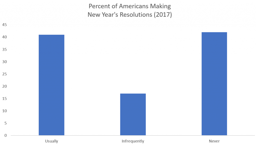
According to a 2017 study by Statistic Brain Research Institute, almost as many Americans usually make New Year’s Resolutions as those who absolutely never do, and only 9% of resolution-makers felt successful.
There are lots of reasons why people succeed or fail at achieving their goals. Edwin Locke, a psychologist whose research established modern goal-setting theory in the late 1960s, identified feedback as one vital component to success. Fifty years later, his theories are still highly regarded.
As I was thinking about this relationship between goals and feedback, I thought Microsoft Power BI would be a great tracking tool. It’s free, so use it! In years past, I used spreadsheets or checklists in journals or OneNote, any of which is a fine way to accumulate a comprehensive list of all that a person wants to do. However, I never measured progress, thereby denying myself feedback. Consequently, I’d let myself get sidetracked during the year.
This year I promised myself I’d try a different approach and thought I’d share the process with you through a series of blog posts. Although I’m going to discuss goal-tracking from a personal point of view, you can also use the same techniques for your business-oriented goals. Either way, I hope you learn something about Power BI along the way and are inspired to do some goal-setting of your own.
Defining targets
There is no shortage of information on the Internet to help you determine your goals. That’s not my area of expertise, so I’ll leave you to figure that part out on your own. Regardless of which method you use, it’s important that each goal has a measurable component and a deadline.
Here’s an example of some goals that I set for the first part of 2018. I am using Excel in this case, but I could have set this up in Google Sheets. In that case, I would need to download the result as an XLSX file to use it with Power BI. Or I could have created a simple text file and used commas to separate each column. (Or I could use Access if I wanted to drive my data professional friends crazy.) Whatever keeps the process simple and easy.
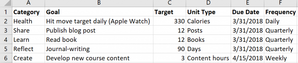
As I thought about my targets, I decided I wanted to have categories for my goals because eventually I could expand this structure and add more goals per category. Furthermore, I might want to compare my progress across categories in the future. I also identified a frequency for each goal to differentiate between those I would track daily, weekly, or quarterly. I’ll use the frequency to create a calculation to measure my progress cumulatively over time. (I’ll describe how to do that in a future post.)
Capturing goal-related activity
With most of my goals, I don’t have a formal data source that I connect to Power BI to keep my data up-to-date. That is, I don’t have some fancy app for goal-tracking that I can use to automate the process of updating Power BI. Therefore, I have to create my own data source and log my data for almost everything.
For my Health goal, I can use the Health app on my iPhone to see the data captured by my Apple Watch. There’s probably more than one way to get this data out without copying it manually, but I want to keep this process simple. I found a way to export Apple Health data without writing code by using the QS Access app for iPhone.
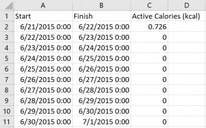
Before committing to a structure for tracking my activity for all goals, I downloaded my Active Calories data by day to see what I could use as a starting point. (I saved it to a Dropbox folder, but I have other options available such as emailing it to myself.) As you can see below, it’s pretty basic (and apparently I didn’t move at all for a while in June 2015 – I think I ditched the watch while I was recovering from SQLCruise in the Mediterranean… and a honeymoon). This data contains only a start and finish date/time and the number of active calories for each day.
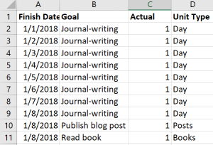
Now I need to capture the data for my other goal-related activities. In Excel, I’ll add another sheet to the workbook containing my goals data. I’ll use a Finish Date column, a column for the goal measurement (which I named Actual in this case), and a column for the Unit type, as shown below. As I complete an activity each day, I add a new row. If I didn’t do something, I don’t add it to the spreadsheet.
Importing and wrangling the data
Now I’m ready to import data into Power BI using Power BI Desktop, which is free to download. Also, my two sets of activity data don’t match exactly in terms of structure and I want to produce a single set of data for the goal activities, so I need to do some data wrangling. Fortunately, Power BI is very good at that task.
First, import the target data:
- Click Get Data on the startup screen if it appears. Otherwise, click the Get Data command on the ribbon.
- Either of the above options leads to the Get Data dialog box where I can select the source type. I’m using Excel so that’s the source I select. I then navigate to the folder containing my file, click Open, and then select the checkbox for the sheet containing my target values.
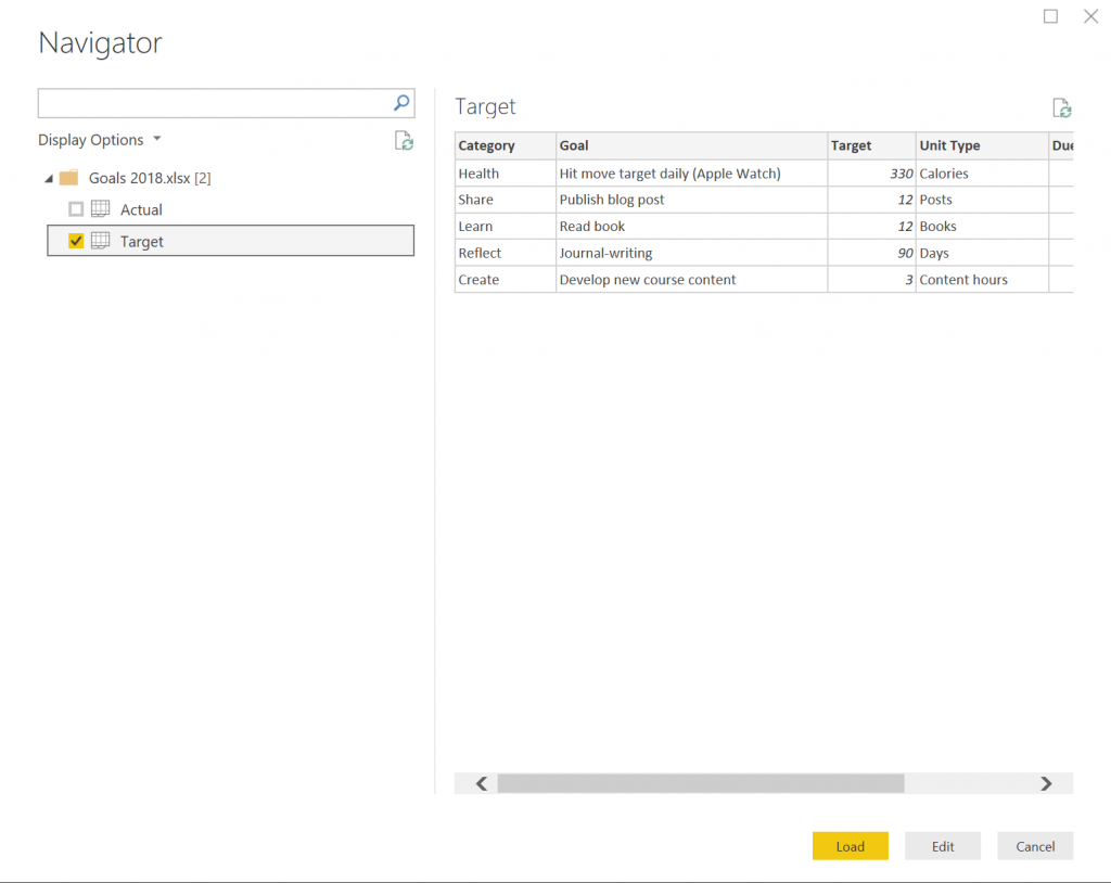
- There’s nothing to change here, so I click the Load button.
Next, I repeat the above steps with some minor changes:
- With Power BI already open, I can only use the Get Data command on the ribbon.
- Then I import the data on the Actual sheet, but this time I click the Edit button instead of the Load button because I need to make some changes to the data before I use it.
Because I had entered some data on my Actual sheet before I finalized the structure, Power BI brought in some additional columns that are empty and useless to me. This might not happen to you, but if it does, it’s easy to fix:
- Click the Finish Date column, hold down the Shift key, and click the last column with data (Unit Type in my case).
- Right-click any of the selected columns, and then select Remove Other Columns on the context menu that displays. That way, you’re left with four columns only.
Now I can import the health data. Because I’m still in the Query Editor screen of Power BI, I choose New Source on the ribbon and then perform the following steps:
- Click Text/CSV, navigate to the CSV file containing the health data, click Open, and then click OK.
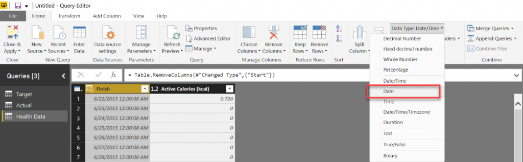
- I do not want the Start column in the final results, so I right-click the Start column, and select Remove.
- I also do not need the Finish Date to have midnight included with the date. To fix this, I change the Data Type in the ribbon from Date/Time to Date as shown below.
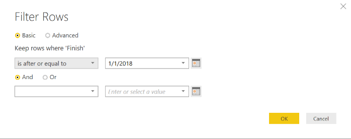
- Also, I don’t care about activity until 2018. Unfortunately, the QS Access app doesn’t let me filter out the unwanted dates, but Power BI does! I click the arrow that appears on the right-edge of the Finish column, click Date Filters in the context menu, click After, click “is after or equal to” in the first drop-down list, and then set the date using the calendar picker, as shown here. Then click OK.
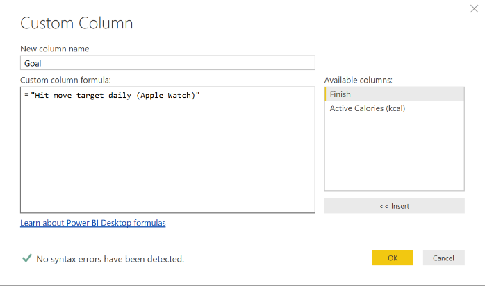
- Now I need to get my health data to look more like the Actual data from the Excel workbook. I need to add a column to hold the goal name. To do this, I click the Add Column tab on the ribbon, and then click Custom Column. In the Custom Column dialog box, I change the column name to Goal and then add an expression in the custom column formula box for static text that matches the goal name in the Target sheet, Hit move target daily (Apple Watch), as shown below. Notice I put double-quotes around the static text. Click OK when finished.
- Now I need to move the column to the left to match the sequence of columns that I have for the Actual data. To do this, click the Transform tab on the ribbon, click the Move command, and select Left.
- I need one more column for the Unit Type. I again click the Add Column tab on the ribbon, click Custom Column, set the column name to Unit Type, type “Calories” as the custom column formula, and click OK.
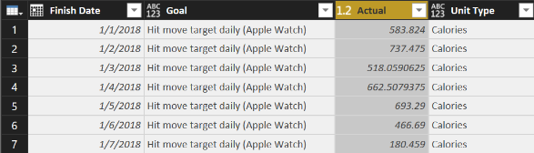
- Last, I need to make the column names consistent with Actual, so I right-click the Finish column, select Rename, and then type so the column becomes Finish Date, and then I do the same to rename the Active Calories (kcal) column as Actual, as shown below. (I exported the data before the end of the day on January 7, so I really did hit my goal… for the record!)
My last data wrangling step is to combine the Actual and Health Data queries.
- In the Query Editor, I click the Actual query in the Queries panel on the left side of the screen.
- On the Home tab of the ribbon, I click Append Queries.
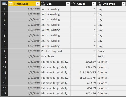
- In the Append dialog box, I choose Health Data in the Table To Append drop-down list, and click OK. If the columns match up properly, both data sets appear as a single query, like this:
- But… in the Actual column, some of my values are integers and some are decimal numbers, so I need to fix that and make the data type consistent across all rows by clicking the Actual column, clicking Data Type in the ribbon (on the Home tab), and selecting Decimal Number.
All the data wrangling is complete for now. I click Close & Apply on the Home tab of the ribbon to move the data from my source files into my Power BI file. That is, Power BI makes a copy of the data that it stores in the PBIX file that it creates when you use the File / Save option .
Enhancing the data model
The steps I’ve performed thus far produce a Power BI data model that becomes a source for reports, but it needs some additional work before it’s useful. When I import and wrangle the data, I use the query editing capabilities of Power BI to consolidate multiple sources, perform transformations, and combine different files into a single query. Powerful stuff!
Now I need to enhance the model to tell Power BI how the target and actual data are related, which is to say I need to define what columns they have in common. By doing so, I can compare my actual performance to the target performance by goal.
To define the relationship between Actual and Target, I click the Manage Relationships button in the ribbon. In this case, I see that there are already active relationships defined, which means Power BI automatically detected the related columns. This usually works, but not always. Having related columns with the same names in each table helps. I can check the relationship by selecting the row that has Actual as the From table and Target as the To table and then clicking Edit at the bottom of the Manage Relationships dialog box to view the relationship:
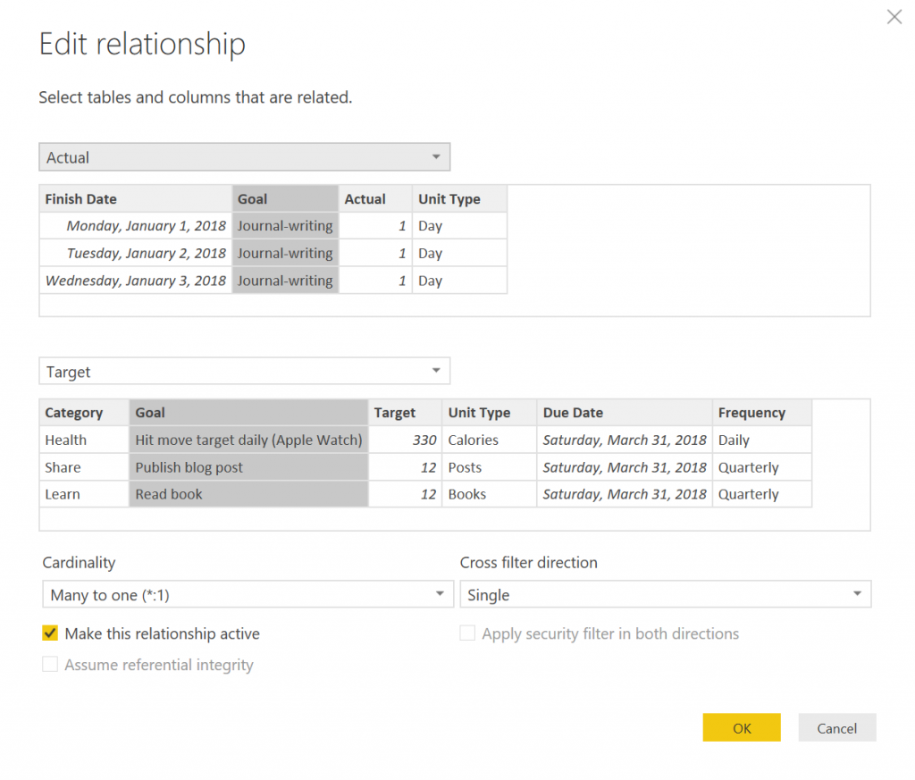
If the relationship wasn’t detected, I can select the applicable table names (which is the same thing as a query name in the Query Editor) with Actual in the top drop-down list and Target in the bottom drop-down list and select the Goal columns in each table. The cardinality should be set as many to one, which means I have many rows of data in the Actual data table that relate to a single row of data in the Target data table. In other words, I can have many rows that reference Journal-writing in the Actual table but only one row for Journal-writing in the Target table.
Close the dialog boxes.
Another enhancement is to hide the Health Data table. Because I combined that data with the Actual table, I don’t need to see it in the model view as a separate table. On the right side of the screen is the Fields list with each table listed. When I expand a table, I can see the individual fields (also known as columns) contained in each table. To hide the Health Data table, I right-click the table name and click Hide on the context menu. Done!
There are more enhancements to make by adding calculations, but that’s a topic for another blog post.
Viewing progress
Even though there’s more I can do to enhance the model, I still have enough in the current model to work with for now.
As one example, I can simply list my goals with target and actual values. To do this, I need to be in the Report view of Power BI. The Report view displays the Page 1 tab at the bottom of the report. (If you don’t see that tab, click the top-most icon in the panel along the left side of the screen.)
Then I can select fields from tables to display. From the Target table (which might need to be clicked to view and access its fields), select the following checkboxes: Category, Goal, and Target. From the Actual table, select the Actual text box. The default visualization for a report is a table, which now looks like this:
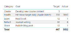
Power BI automatically sums up the Actual values for each goal. The “problem” is that my Actual value for the health goal is for a week, but the target is for a single day. I’ll explain how to handle this in my next post.
There many different ways to represent, or visualize, this data, which… you guessed it… is coming in another post. By then, hopefully you can come up with your own goal list, gather your activity data, and start monitoring your progress on your way to crushing your own 2018 goals!
When you update your spreadsheet with Actual values, which you can do as often as necessary, you do not need to repeat the steps to import the data into Power BI. Just click the Refresh button on the Home tab of the ribbon when viewing your report. Power BI reads the data directly from the source (assuming you don’t move it to a new location) and updates the data model with the latest and greatest data.
Learning more about Power BI
Although I covered several Power BI concepts in this post, I didn’t cover them in depth. If you’d like to learn more, I have a few resources for you to explore these concepts in more depth:
- If you’re the type of person who likes to read product documentation, check out these topics from Microsoft:
- Power BI can connect to a variety of data sources, not just spreadsheets or CSV files. In fact, the list of data sources you can use keeps growing!
- Power BI also supports many different ways to wrangle data, otherwise known as the steps to transform and shape data.
- Data modeling takes the wrangled data to the next step by defining calculations (which I have yet to explain) and defining relationships between tables.
- The fun part is creating reports in Power BI to view your data from various perspectives. In this post, I barely scratched the surface of possibilities, but I promise there is more to come.
- If you prefer to read a whole book on the topic, I can recommend these books written by my friends from Italy, Alberto Ferrari and Marco Russo. (They also provide a ton of materials at https://www.sqlbi.com.)
- Introducing Microsoft Power BI (Kindle Edition)
- Analyzing Data with Power BI and Power Pivot for Excel (paperback edition, but there is a Kindle version available, too)
- If you’re a visual and auditory learner, check out my Pluralsight course, Getting Started with Power BI. It’s one of my most popular video courses ever! If you’re new to Pluralsight, you can even sign up for a FREE 10-day trial (up to 200 minutes).
Featured image copyright: alonastep / 123RF Stock Photo
3 Comments
[…] Stacia Varga uses New Year’s resolutions to motivate a Power BI tutorial: […]
[…] my previous post in this series, I explained how to capture and load goals data into Power BI and produced a very simple report […]
[…] that I have data both for my goals and for my subsequent goal-related activity as described in my first post in this series, and I have added calculations to quantify my progress as I described in my previous post, I’m […]