In my previous post in this series, I explained how to capture and load goals data into Power BI and produced a very simple report that compares actual to target values for individual goals. But already I know there are a couple of problems with it.
Understanding the problems
First, the actual data represents the accumulation of data by day from the beginning of the year, whereas the target data represents the final tally at the end of a defined period. Each goal has a different frequency: daily, quarterly, and weekly. Currently, the comparison between actual and target data makes it appear that I’m falling way short of my goals. However, even if I were making solid progress on my goals on a daily basis, the comparison of the two values will never meet until the end of the defined period for any given goal. I need a way to prorate the target data so that I can more reasonably measure my progress.
Second, displaying the actual and target values in a table requires me to do mental math to determine how close (or not) I am to achieving my goals. Now, I’m pretty good at mental math, but a better way to see progress is to use data visualizations. I’m sure you’ve heard the saying… A picture is worth a thousand words.
Solving the problems
Power BI makes it very easy for me to solve both of these problems! In this post, I’ll focus primarily on the calculations. In next week’s post, I’ll start working with the data visualizations.
The addition of the necessary calculation to the model requires several steps:
- Creating a date table. This step is necessary because I’ll be using some functions that understand how to work with dates and I need a complete set of dates to work with. My Actual table may or may not include dates for every day of the year, so I need to make a table dedicated to dates.
- Creating some new columns in the Actual and Target tables. A column is a calculation which gets evaluated row by row and adds data to the table just as if it had existed in the original source.
- Creating a new measure in the table. By contrast, a measure is calculated when you use it in a table or some other visualization.
These steps will make more sense when you see how I create and use these objects. In each case, I’ll be creating these objects by using a formula language called DAX, which stands for Data Analysis Expression language. I can’t teach you everything you need to know about DAX in a single article, so I’ll just provide the formulas I use (including links to the official explanation) and explain a bit about each one.
Creating a date table
This step is super easy. On the Modeling tab of the ribbon, I use the New Table command.

A new table appears in the Fields list and the formula bar is waiting for me to provide a name and a formula for it. (By the way, I refreshed my report which now includes two weeks of data, so now I have new values in the Actual column.)

In the formula bar, I need to type the following formula:
Date = CALENDAR(“1/1/2018”, “12/31/2018”)
The CALENDAR function takes a start date and an end date to use for building out a table of dates. For now, I’ll work with a single year, but I can easily change this next year.
After pressing enter to save the formula, I’ll go to the Data view by clicking the middle icon in the navigation panel on the left side of the screen. Then I click the Date table in the Fields list on the right to view the table created by the Calendar function.

Right now, the date values in the table display using both date and time. I’d rather just see dates. To fix this, I can click on the Date column, click the Format drop-down list in the middle of the ribbon, point to Date/Time, and select 3/14/2001 (m/d/yyyy) to adjust the formatting.
I also want to create a relationship between the Date table and the Actual so that I can apply filters to these tables by Date and to perform date calculations correctly. I explained how to set up relationships in my previous post.
On the ribbon, I click the Manage Relationships button. Then I perform this series of steps:
- Click New in the Create Relationship dialog box.
- Select Date in the first drop-down list.
- Select the Date column.
- Select Target in the second drop-down list.
- Select the Due Date column.
- Click OK.
- Click Close.

Creating new columns
Next, I need a column to produce a value that I can use to prorate by day, week, or quarter. Specifically, I need to divide the target value by the number of days for the time period referenced in the Frequency column. To create it, I’ll use the New Column command in the ribbon.

This command allows me to add a calculation that prorates my target value according to the designated frequency:
- Before I click the button for the command, I click the Target table in the Fields list on the right so that my new column gets added to this group of fields.
- When I click the button, a new generic column appears in the Fields list and the formula bar is waiting for me to provide a name and a formula for it.

Here is what I type into the formula bar:
Daily Target = SWITCH([Frequency], “Daily”, [Target], “Weekly”, [Target] / 7, “Quarterly”, [Target] / 90)
When I press Enter, the new column appears in the Target table with a name of Daily Target. In addition, the expression is evaluated row by row and stored in the Power BI data model, just as if I had imported it in from my source Excel spreadsheet. This means also that Power BI requires more memory from your computer to store this value when you have the file open. Not a big deal for a small amount of data like this, but something to consider when creating Power BI files with millions of rows of data in a table.
To interpret the SWITCH function, Power BI looks at the first argument, [Frequency], and then uses its value to determine what value to store in the column”
- The pair of arguments, “Daily” and [Target], are used to compare with the value of [Frequency] in a given row. If it is “Daily”, then the value found in the [Target] column on the same row is stored in the [Daily Target] column.
- The next two arguments, “Weekly” and [Target] / 7, are used similarly, except that the [Target] value is divided by 7 to turn a weekly goal into a daily goal value.
- Last, the “Quarterly” and [Target] / 90 results in a daily goal value for a quarterly value in the [Target] column.

Next, I need a cumulative target value for some of my goals. As an example, consider the goals that are not daily, such as Publish Blog Post or Read Book. When I’m tracking my progress towards these goals, I want to compare how many times I did the task to the number of times I expected to do the task between the beginning of the year and the time I last did the task.
That is, I need to translate my quarterly goal of 12 posts to a daily goal and then multiply that by the number of days from January 1 to today (January 15). That means my target at January 15 is 1.95, calculated by multiplying .13 (the daily goal) by 15 (the number of days since January 1).
I want this calculation in my Actual table, so I click that table in the Fields list, and then click New Column in the ribbon, and type the following formula in to the new column’s formula bar:
Cumulative Target = SUMX(DATESBETWEEN(‘Date'[Date], “1/1/2018”, ‘Actual'[Finish Date]), RELATED(‘Target'[Daily Target]))
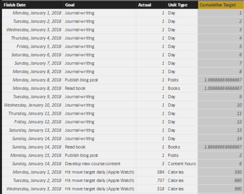
This is more advanced DAX than the previous calculation. Let me break it down for you. The first argument of the SUMX function is DATESBETWEEN(‘Date'[Date], “1/1/2018”, ‘Actual'[Finish Date]). This expression looks at the Date table and creates a mini-table in which the first row is January 1, 2018 and the last date is whatever the Finish Date is for the current row.

Remember that column expressions get evaluated row by row. So in row 1 of the Actual table, the [Finish Date] is January 1, 2018, so the mini-table has only 1 row containing January 1, 2018.
The second argument of the SUMX function is RELATED(‘Target'[Daily Target]). This is evaluated by “traveling” along the relationship between the Actual table and the Target table, which is the reason I created a relationship as described in my last post. Power BI looks at the common column between the two tables—Goal, in this case. And then it finds the [Daily Target] column value for the matching row in the Target table.
In other words, in row 1 of the Actual table, the Goal is Journal-writing. Power BI finds the corresponding row in the Target column, and returns the [Daily Target] value, 1.
Now Power BI evaluates the SUMX function itself. The way to think about this is to say to yourself – for each row in the first argument (the mini-table of dates) – what is the Daily Target? Once it gets this value for each row in the table, it adds together (sums) these values.
Now wait a minute, the Date table is not related to the Target table, so how does this work? Admittedly, this looks confusing, but remember where the calculation occurs… inside the Actual table, row by row. There’s a technical term for this—row context.
The row context of row 1 is Journal-writing, and this is the context that applies when the RELATED function is evaluated. There is only one date between January 1 and the Finish Date in row 1, so the sum of one Daily Target here is… 1.
Then for row 2, there are two dates in the mini-table, January 1 and January 2. Therefore, the Daily Targets are 1 and 1 respectively, which sum as 2, and so on.
I can go back to my Report view (by clicking the first icon on the left side of the screen) and select the existing table. I do this by clicking anywhere in the screen real estate that “belongs” to the table, and I can tell it’s selected by the rectangle that appears around the table. Then I can select the Cumulative Target and Date check boxes to add the column to the table, as shown below.

Power BI recognizes the Date column as a date data type, so it breaks out the date into Year, Quarter, Month, and Day, which I don’t find particularly helpful for this table. I can change this by clicking the arrow to the right of Date in the Values well in the Visualizations pane, and then selecting Date, as shown below.

The table shows individual dates now. However, in its current form, it still doesn’t show data the way that I would like.
Some goals are daily goals, so comparing Actual to Daily Target is fine. But I want a separate table for the goals that aren’t daily. I can make a copy of the current table and paste it into the same page so that I can use the tables as starting points for more meaningful visualizations. To do this, I make sure the table is selected, click Copy (on the Home tab of the ribbon), and then click Paste in the ribbon.
A second table displays in the report, but it might be hard to tell that there are two because one is right on top of the other. I can drag the new table by placing my mouse on the two lines above the table and, while holding down my left mouse button, dragging the table to a clear spot in the report as shown below.

I can now apply a filter to the bottom table (the one currently selected) to display only goals that are not daily goals. I do this by dragging Frequency from the Target table to the Filters list in the Visualization page, as shown here.

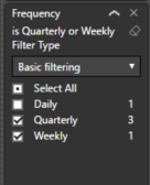
Then I select the Weekly and Quarterly check boxes, as shown here, to apply a filter to the selected table.

Next, I select the top table, add the Frequency filter to the visualization as I did above, but this time I select the Daily check box. Then I click the X next to Cumulative Target in the Values well for this table to remove the field from the table, because I don’t need it for my daily goals. I simply want to compare each day’s actual value to the daily target, and that’s it.
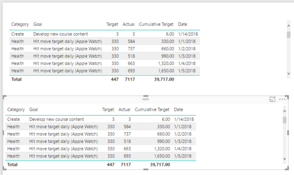
I want the bottom table to show only the Cumulative Target and Actual values without dates. This time, I click the X next to Date and Target in the Values well to remove the fields. My report now looks like this:

Notice the scrollbar to the right of the top table. That means there are more rows to display, but Power BI is honoring the boundaries of the table on the report. Otherwise, it would overlap the bottom table.
Hmm, something is little funky there with Journal-writing because the cumulative target is 105 and that’s not right. It’s taking the sum of the individual Cumulative Target values for each date – 1 for January 1, 2 for January 2, 3 for January 3, and so on. Really what I want to see here is the last value. There’s a way to do that, but that means I need to do something new…
Creating a measure
On the ribbon, I make sure to click the Actual table in the Fields list, and then click New Measure to open up the formula bar.

The formula to use is:
Target To Date = MAX(‘Actual'[Cumulative Target])
This tells Power BI to use the highest Cumulative Target value, which will also be the last, for the current filter context. Filter context is a subject I’ll tackle another day, but suffice it to say for now that all the filters in the panel to the right as well as what you see in the visualization for a given row affect the measure calculation. It’s a little more complicated than that, but… another day.
Adding a new measure is much like adding a new column, but the behavior is different. If you were to look at the data page, you won’t see a new column showing your measure values row by row. The only way to see a measure’s value is to include it in a table or other visualization. So… I’ll add the measure to the bottom table and remove the Cumulative Target field.
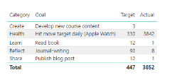
Now the report displays the values that I want:

The grand totals don’t really make sense in this report, but I’m going to turn these into charts later, so I’ll ignore those for now. But the inconsistency in layout is bothering me with Target first in the top table and second in the bottom table. I’ll fix that by clicking the bottom table, and then dragging the Target To Date field above the Actual field in the Values well, like this:

Success!

In my next post, I’ll explore different ways to show this data.
In general, as I review my goals, I can see I’m mostly on track for the first two weeks of January, except for the Develop New Course Content. I better get cracking…

2 Comments
[…] Stacia Varga shows how to use Power BI to simplify data analysis, using the example of New Year̵…: […]
[…] first post in this series, and I have added calculations to quantify my progress as I described in my previous post, I’m ready to start visualizing that progress, which is where Power BI really […]