I had to cut short my last dabbling in distribution post because I had to get to Game 2 of Round 1 of the playoffs between the Vegas Golden Knights and Los Angeles Kings, which was am amazing game with not one, but two, overtime periods! That made for a very long night.
Hmm.. I’m going to have to poke through the data another day to ask my next question – how many times does a game go that far? Meanwhile, since that night, the Golden Knights swept the round, winning a stunning four games in a row and knocking the Kings out of the playoffs! But if you follow these things, you already knew that, didn’t you?
But today I still want to continue exploring visualizations for distributions using the dataset that I introduced in my first post in this series if you need to catch up with what I’m up to here. So far, I’ve used a histogram on a single value and both a histogram and a density plot for comparing two values. For these visualizations, I used R scripts to easily and quickly visualize the distribution.
The problem with that approach, however, is that R visuals don’t play nicely when I want to embed Power BI into a web page, or share with someone who is using only the free version of Power BI.
Fortunately, I can use the Box and Whisker visual which is a compact way to get a lot of information about my data. In the example below, I have set up slicers to focus on a single season, a league, and two teams–the Golden Knights and the Kings. Then I added the Box and Whiskers custom visual by Jan Pieter Posthuma – whom I met once long ago and “adopted” at SQLBits X in London. (If you’re not familiar with the steps to do this, see my first post on distribution in which I describe the process.)
If you want to compare other teams, go ahead. This is an interactive report! Change the season, league, and teams any way you like!
Here’s an example of how I configured the visual:
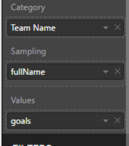
The Category determines how many boxes appear in the visual, the Sampling determines the individual rows that get used for determining the distribution, and the Values is the numerical variable used to compute the box-and-whisker plot.
So, how to interpret all this?
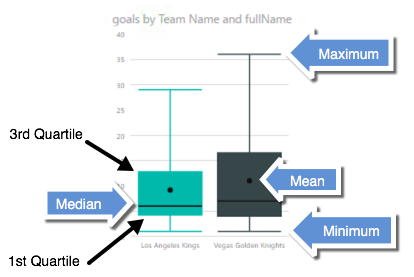
That’s a lot of information packed into one little visual! The box contains the boundaries of the second and third quartiles – a sort of broad middle, if you will, as well as the mean and median. The lines representing the minimum and maximum are the whiskers.
And by setting up multiple categories, I can easily do some comparisons. In fact, I think for “at a glance” comparative analysis of distributions, I prefer this layout instead of the histogram or density plot. Don’t get me wrong. Those are useful also, because they give me an idea of the shape of the data. However, the box-and-whisker plot lets me easily see and compare the edges and the middles.
And a quick little bonus if you go to page 5 of the report above. The R visual doesn’t display, but… at the top of the page is another way to view distributions. Here is a simple count using the Heat Streams custom visual:
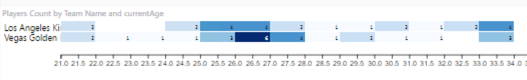
This is a quick and easy way to see where values are concentrated. Here I can see that most of the Golden Knights are in the 26-27 age range and then plus or minus a year, whereas the Kings ages are distributed differently. The visual is intended to work for time on the horizontal axis, but it also works with continuous values like age as you can see above.
The moral of this story is that different styles of distribution visualizations provide different types of insights into the data. Try them all and see what your data tells you!
Feel free to download the PBIX file if you want to play with the data yourself.
In my next post, I’m moving on… to relationships.
1 Comment
[…] I’ve got more to say about other ways to visualize data distributions, but… there’s another playoff game tonight and I gotta go! Until next time… […]